top of page

TrophyTracks
Role/Team
Visual Designer
Team of Two
Tools


Date/Duration
4 Months
Apr 2022 - Aug 2022
Problem Statement
TrophyTracks is a hunting data logging app that caters towards hunters. I came on to the team working as a UX/UI design intern at TrophyTracks, to help redesign their application to make it more comfortable for all kinds of hunters. The end goal was to deliver a full set of designs with a much more approachable user interface.
Problem Solution
Our motive with this project was to tackle multiple issues in the current design to help adjust them for a more streamline experience.
After reviewing the entire application, my team and I layout the following goals:
-
Revamped Home page with new accessible info.
-
Easier navigation for the user across the application.
-
Updated entry options for more scenarios.
-
New ways to allow hunters to post images directly from the app.
-
Organized hunts to allow more consistent cataloguing.
-
More defined Pro screen to be more clear on given options.
Concepts/Wireframes
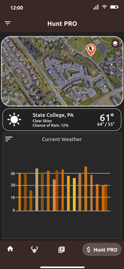
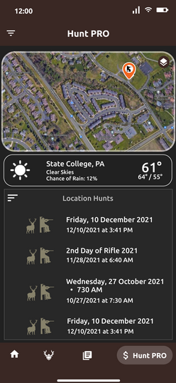
Since the research for the users had already been completed by the time I arrived on the project, my partner and I devoted our focus on fixing up the old designs. To do this we reviewed old mockups in the team's current Figma project file. The following mockups showcase the previous wireframes and what areas we decided to work on for changes.


We viewed key areas of the user interface to see where we could improve certain aspects to include more options and information.
The original design empathized traditional hunting colors through browns and oranges.
Outside of light yellow used on boxes to represent paper, we adapted other previously used colors into more buttons and functions.
This was the original look of the Hunt Pro page, a place for advertising more potential features for the app.
The goal here was to improve the overall flow of information for Hunt Pro subscribers that felt more consistent with the rest of the app.

Frames like Hunt Screen and TrophyRoom were ones we prioritized to add simple changes to button layout, color correlation and information placement.
After feedback, we redesigned each section to feel more cohesive with a updated feel to allow more room for implementation.

Visual Design
After examining the wireframes I developed a typography guide to help with future changes if new components were introduced. From there we ran through several mockup runs with the rest of team before finally coming to a satisfied result at the end of project.
-
Font Used
Ubuntu
ABCDEFGHIJKLMNOPQRSTUVWXYZ abcdefghijklmnopqrstuvwxyz
1234567890
The Ubuntu Font Family was started to enable the personality of Ubuntu to be seen and felt in every menu, button and dialog.
Ubuntu Bold
Ubuntu
-
Colors Used
3E2723
Old Burgundy
6A4F4B
Liver
1B0000
Xketic
FF6000
Safety Orange
FF923E
Deep Saffron
C42B00
Rosso Corsa
High Fidelity Designs

Prototype
This video runs through the basic functions of TrophyTracks with the updated design aspects we adapted.
The demonstration goes through the Dashboard, New entry, Hunt Screen and Hunt Pro Screens.

As shown screens were redesigned with the intent of adding higher fidelity to give users more options without over flooding them information.
Takeaways
Before this experience, most of my design experience came from school projects which consisted of projects that weren’t fully fulfilled. While at Trophytracks, however, I was able to express my design skills for the first time in a more widely open concept.
While working as an Application Designer I was able to understand a design flow in the field by testing multiple wireframes with superiors to get a better understanding of adaptation of the project. It also gave me a better focus on my design tools with more insight into how to utilize them more effectively.
bottom of page


